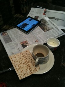
Kirschner's breakfast, iPad mit matzo
Novelty factor waning….NOT.
When the NYT hit my doorstep at 7am, I realized that I was still slave to my Pavlovian training for that sound. Really, I could have been reading the NYT for hours before.
Fresh from my triumphant pairing of my bluetooth keyboard to iPad (but darn, doesn’t work on TWO computers at once, i.e., I have to choose whether to pair the keyboard with the iPad or with my iMac, which is a pain in tush. Also means I”ll have to buy another $69 keyboard. On the bright side, who knew that the keyboard had an on/off switch? Maybe now I’ll save batteries.
The brightness of the NYT on my breakfast table really put the dingy newsprint in the corner. Gorgeous! BUT: what was the NYT thinking of when they failed to merge the two NYT applications? What’s “Editor’s Choice,” which is clearly iPad friendly and much better for navigating the paper than the iPhone app, and why is it not complete? Really wanted to read Clark Hoyt and he’s in iPad limbo. Sent me back to the iPhone app, which now looks sadly grainy low resolution and iPhone-ish when you return to it. Why does Editor’s Choice only offer two frames, then nothing, not even a cue that more navigation comes with the bottom row indices?
A real mystery: why are there absolutely no links? Now, that’s truly wacky. No hyperlinks at all. So when you’re reading about gilt.com — how come I didn’t know about that?? — there’s no link to gilt.com. Was this a corporate compromise to keep you on the site? Nah, smart guys like Martin Nisenholtz know better. So maybe I am missing something in this next step in the multimedia newspaper dream.
Oh, of course I’m experiencing perhaps the most serious concern about the iPad vs. a “real” computer. You can’t really multitask. If I opened Gilt.com, I’d be closing the NYT app. But that was true on the iPhone too, so in a way, I’ve been trained to get used to that, accepting the trade-offs.
Complaint on a more mundane note: every paragraph of every NYT story on Editor’s Choice ends with a line that has inconsistent leading. Too much white space between it and the line above. Looks sloppy.
Bottom line, carps above notwithstanding, I could easily get used to this. Huge fear factor about spilling my morning coffee, though. NYT should offer a sweet kickstand just for this purpose. A cross-marketing opportunity with Starbucks!*
I will work today. I will work today. I will work today.
Wonder how the WSJ app looks?**
I will work today.***
*For those of you into semiotics of the breakfast table, note the matzo and Temptee cream cheese.
** Snuck a look. WSJ looks more newspaper-like, integrates video, much better navigation. All in all, better first experience than NYT.
*** At least until my gilt.com membership arrives.